Exhale, everyone. The building products, kitchen and bath industries are back. While the homebuilding industry is growing at a slow but steady pace, the 2015 NAHB International Builders’ Show (IBS) and Kitchen and Bath Industry Show (KBIS), held in Las Vegas last week, were filled with optimism about the future. Exhibitors at IBS/KBIS had only positive things to say about the increased traffic to their booths, quality of conversations with visitors and overall energy compared to previous years.
Point To Point was on-site at IBS/KBIS to support our clients and take note of new innovations aligned to product and marketing initiatives. As a customer engagement agency, we are always thinking about our clients’ customers and building programs that attract, retain and engage their target audiences.
Here is our take on a few exhibitors who took a very thoughtful and deliberate approach to designing their booths to engage builders and designers.
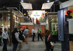
Plygem, a manufacturer of various building products, had a large open floorplan with several interactive displays and abundant seating, an essential component to welcoming and catering to the tired feet of builders walking the show. The company avoided gimmicky games or treats to attract visitors to experience its products (despite what you may think, games and contests are not effective). The interactive displays combined with an active team working the booth were the perfect way for builders to get up close and personal with Plygem products.
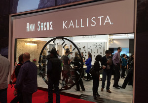
Kohler’s booth, which never disappoints, was clearly inspired by a string of boutique jewelry shops. Rather than mounting its kitchen and bath fixtures along a wall, Kohler perfectly displayed its wares as if they were pieces of jewelry, each with its own personality and flair. Additionally, with a floor-to-ceiling graphic wrapping the entire space, requiring you to enter through doorways, the brand created its own enclosed environment which was never distracted by booths surrounding it. When you were in the Kohler booth, all you saw was Kohler products. Not the booth next door. Kohler’s various sub-brands had their own “boutiques” with a separate design aesthetic for each; even the sales team members were dressed differently. It did not feel like you were looking at a faucet or fixture but rather a luxury object that you absolutely had to have. Visitors could also experience the products first-hand. Even though we all know what water feels like, visitors could not resist running their hands through the tubs that were filled with water, the shower heads spraying at different rhythms or the water that beautifully ran from the faucets. Again, no gimmicks, just a great venue to experience products one-on-one.
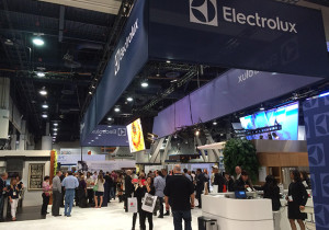
Electrolux was only selling one thing at IBS this year: the product experience. Placing all of its displays in vignettes of kitchens and laundry rooms around the exterior of the booth reduced sight lines to other vendors and increased the appeal of Electrolux products. As visitors navigated the space, the products faded to the background and the cooking experience, coming from professional chefs using the appliances, came to the forefront. The focus wasn’t on the products – it was on the experience you had – and felt – using them.
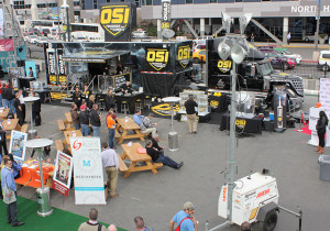
OSI, known for its professional-grade construction adhesives, took a unique approach to exhibiting at IBS. Its booth, a 53-foot hauler and trailer located outside the conference center in the Professional Builder Show Village area, attracted a large majority of attendees going in and out of the conference. In full disclosure, OSI is a Point To Point client, and together we collaborated to bring its IBS booth experience to life. Because OSI’s brand and products have been developed through input from the contractor community, it was critical to create a robust experience for show visitors to truly experience the brand’s new flagship product, QUAD® MAX, firsthand. Above and beyond a standard product demonstration, OSI took it to the next level, having unique demonstrations to illustrate every single one of the product features and attributes. For example, to showcase that the product can be used in extreme temperatures, tubes of QUAD MAX were frozen in blocks of ice. Then OSI had visitors chip out the tubes from the ice and immediately extrude the adhesive with the tube fully immersed in water. Again, all about the customer experience.
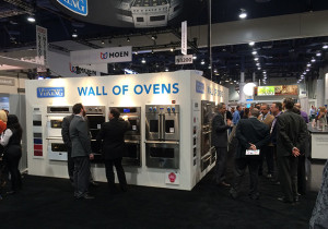
Viking, manufacturer of professional kitchen appliances, took a completely different path than every other company on our list. Literally. Its booth design was pretty straightforward: banks of ovens, ranges and refrigerators that attendees could examine. So how did they make a bunch of stainless steel appliances grab everyone’s attention? They utilized floor clings around the booth to drive people to see celebrity chef demonstrations. And unlike most exhibitors, they included pricing on every single product. With prices on the products, designers and builders could see exactly what they were dealing with and know immediately if they were the right audience for the product. Viking’s sales team did not have to waste time interacting with an audience that would never be buyers and a visitor’s time was never wasted. Regardless of your industry or the trade show at which you exhibit, the key takeaway here is to ensure you’re delivering an experience for your booth visitors that encourages engagement and the creative ability to use, touch and feel your products first hand. Shift the focus from you to that of your prospective customer. It will go a long way and generate a whole new return on your significant trade show investment.